
VOA · Brand Strategy · Visual Identity · Brand Expression
Designed to move with you.
VOA is built for the generation that treats the city and the coast as one continuous day. We gave it a point of view, a palette with a pulse, and a system loud enough to survive a beach and precise enough to survive a shelf.
01 · The brief
How does utility become self-expression?
VOA was conceived for the modern nomad — a design-aware generation moving between urban routines, coastlines and plans made forty minutes ago. The products are practical. The problem was that practical, in this category, usually looks like an apology.
Every competitor sorted itself into one of two rooms: technical gear that reads like equipment, or beach product that reads like a souvenir. Neither describes how anyone actually lives. The bag that carries a laptop at 9am carries a towel at 6pm.
So we refused the split. The strategy was to stop treating the city and the coast as opposite destinations and start treating them as one state: motion. Not where you are — how you are. From that single move the whole system falls out: bold enough to be seen at distance, modular enough to work across formats, warm enough to be wanted.
The response: a brand system that combines a clear point of view with a bright, playful visual language. Function meets fun, and neither one flinches.
02 · Creative territory
An attitude, not a destination.
Before a single mark, we defined the feeling: energetic, adaptable, ready to leave the routine behind. Three principles came out of that room and governed every decision after it.
- Modular & adaptable
- One kit, many days. Every asset is built to be recombined rather than reproduced.
- City-to-beach
- No mode switch. The brand reads the same on asphalt and on sand — the context changes, the voice doesn't.
- Vibrant by design
- Color is the product's loudest feature. Saturation held at full, never filtered down to look expensive.
03 · Visual vocabulary
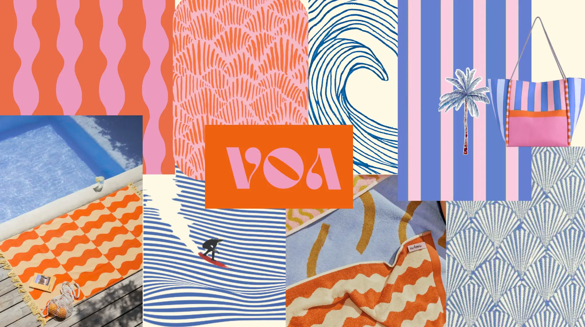
A graphic coast, built to move.
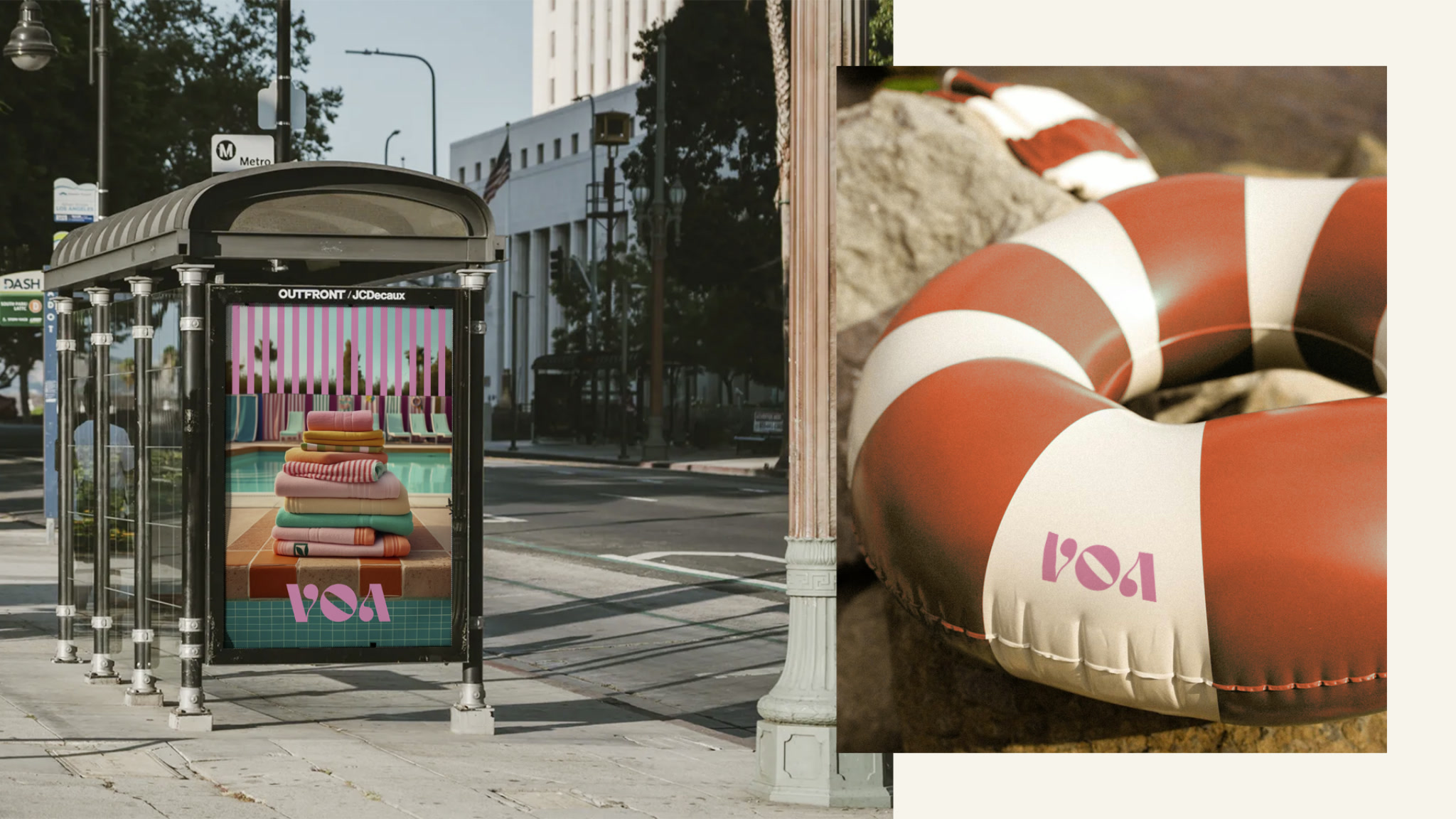
The exploration set the material language: warm color, coastal rhythm, iconic pattern, and a playful sense of scale. Coastal escape · graphic rhythm · warm utility.

04 · Final identity
Freedom in motion.
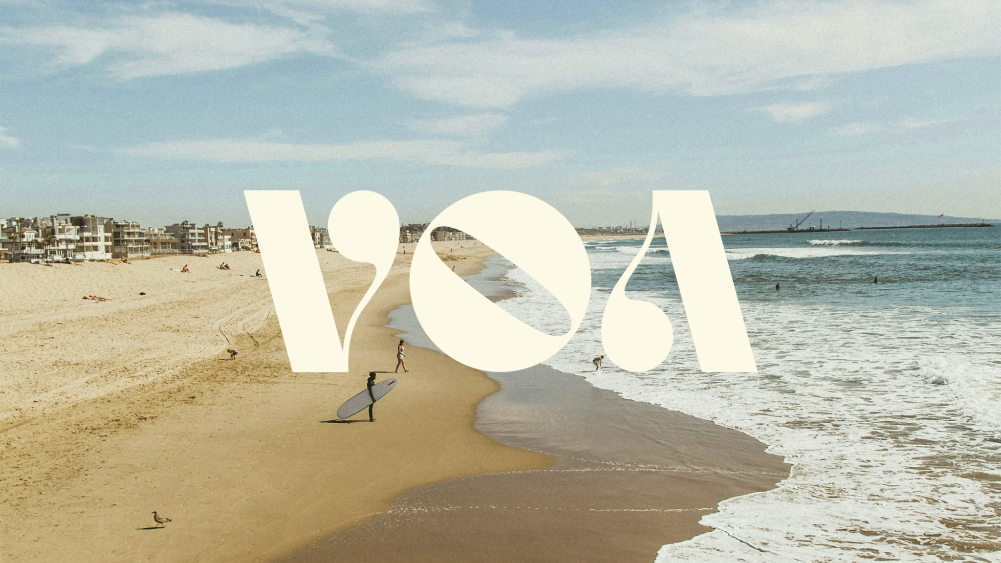
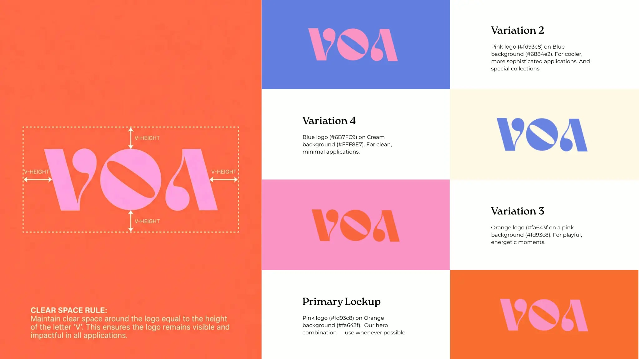
Voa is the imperative form of the Portuguese verb to fly. Not a noun, not a place — an instruction. The name is already the brief: go.
The mark answers to it. Compact, rounded, weighted to hold its own at the size of a woven label and at the size of a wall. One signal, legible from a moving car and from arm's length on a phone.
05 · Brand world
A system with a pulse.
Four colors, four jobs. Assigned roles rather than percentages, so the palette survives contact with people who aren't us.
VOA Coral
#F0522F
The impulse. Signage, hero surfaces, the first thing seen.
Bubblegum
#F2769D
The signature. Play, type accents, the mark itself.
Royal Blue
#2C43A6
The clarity. Structure, wayfinding, contrast on brights.
Cream
#F4EBDC
The breath. Space between the loud parts.
06 · Digital expression & touchpoints
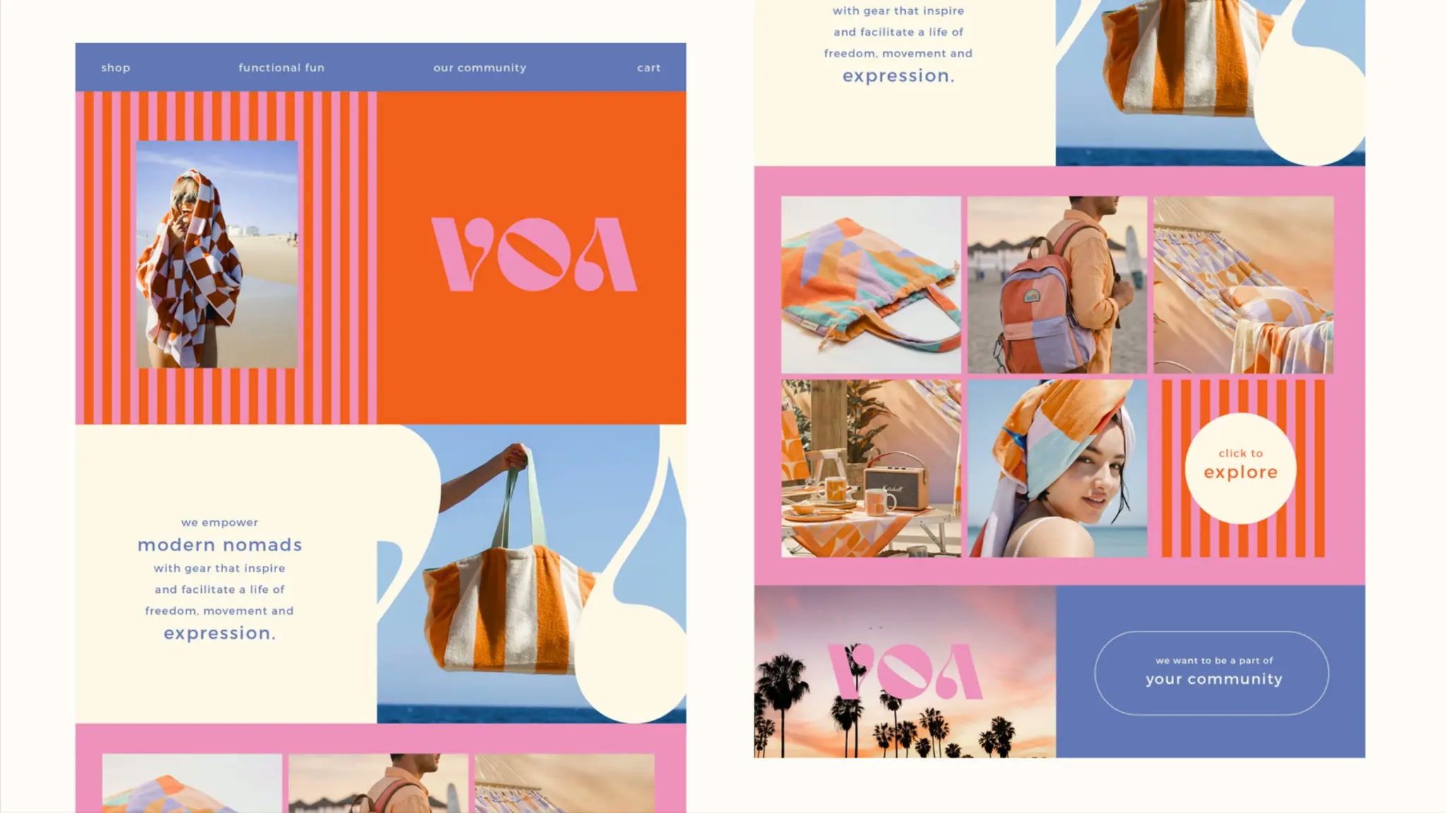
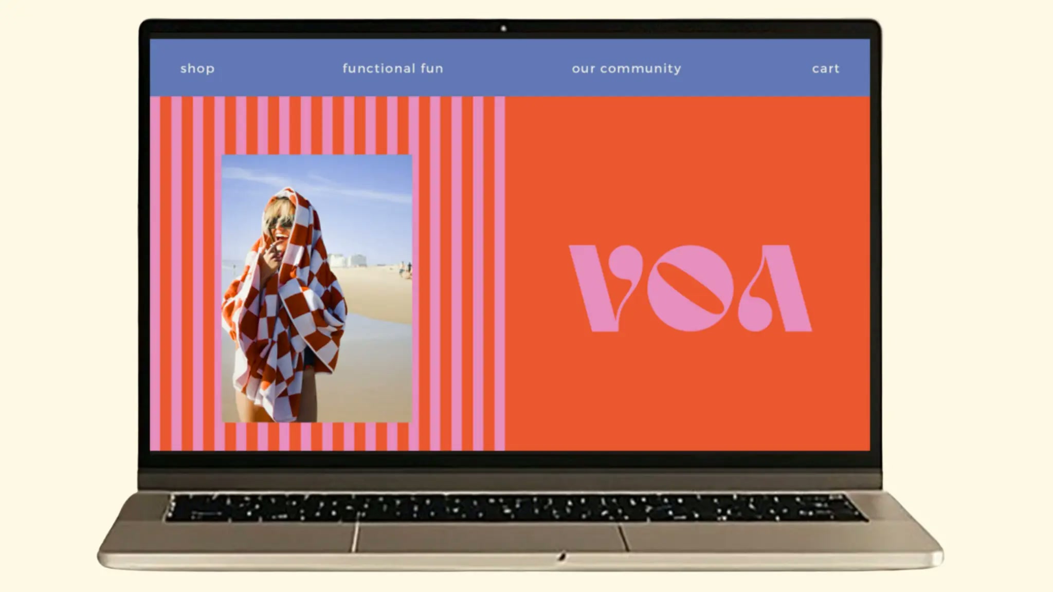
Every touchpoint speaks VOA.
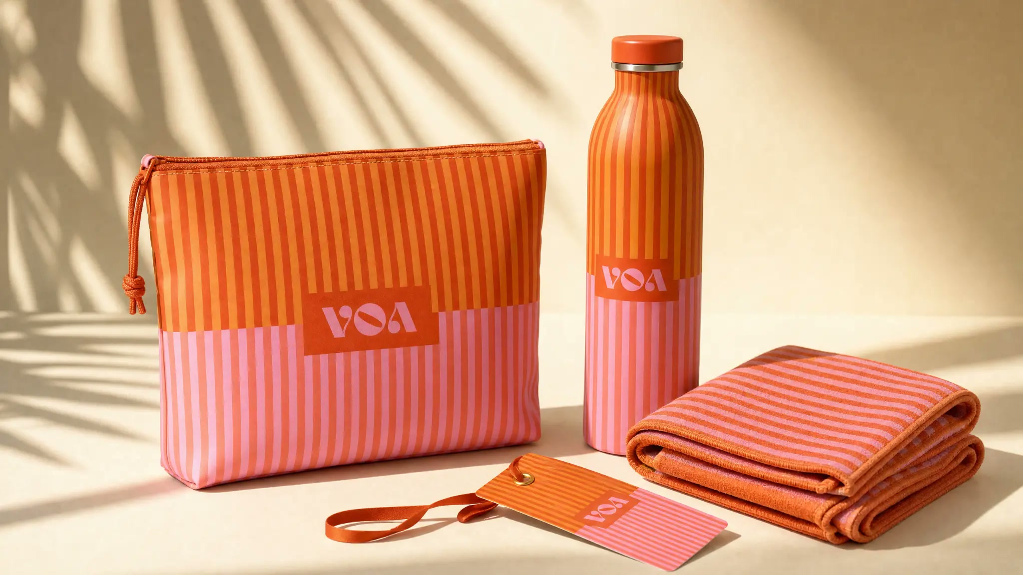
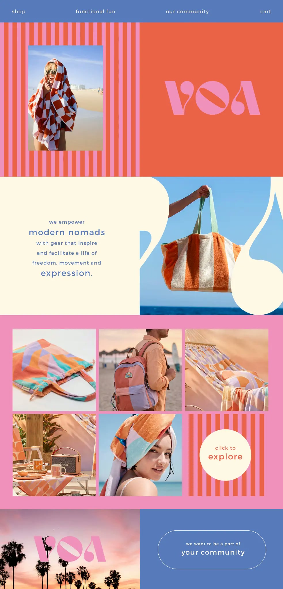
The identity shipped as a living toolkit, not a PDF. A scrolling storefront, a social grid with its own rhythm, retail bags, inserts, and the small details that make an encounter feel intentional. Same energy at every scale — bright, bold, unmistakably VOA.
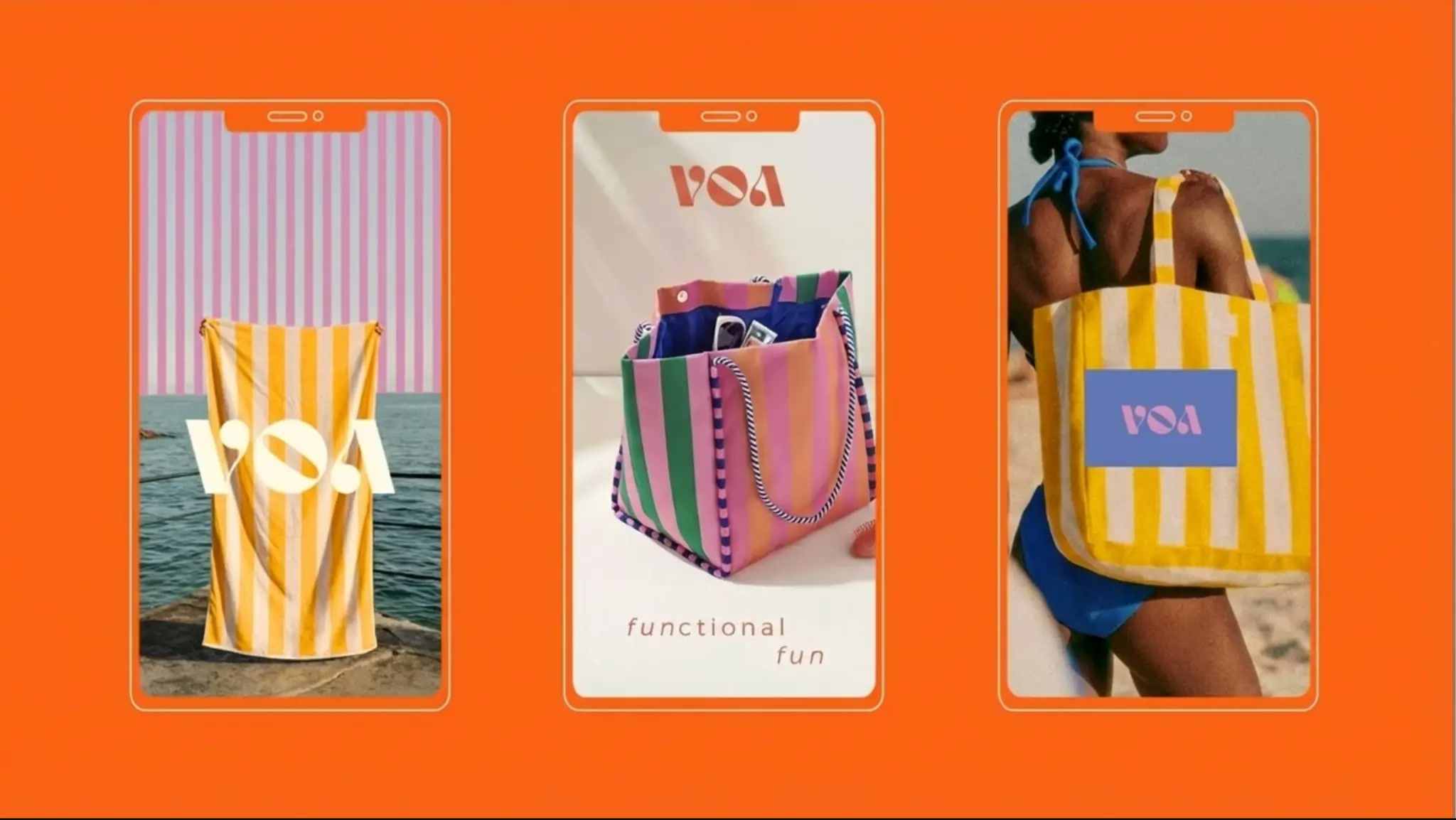
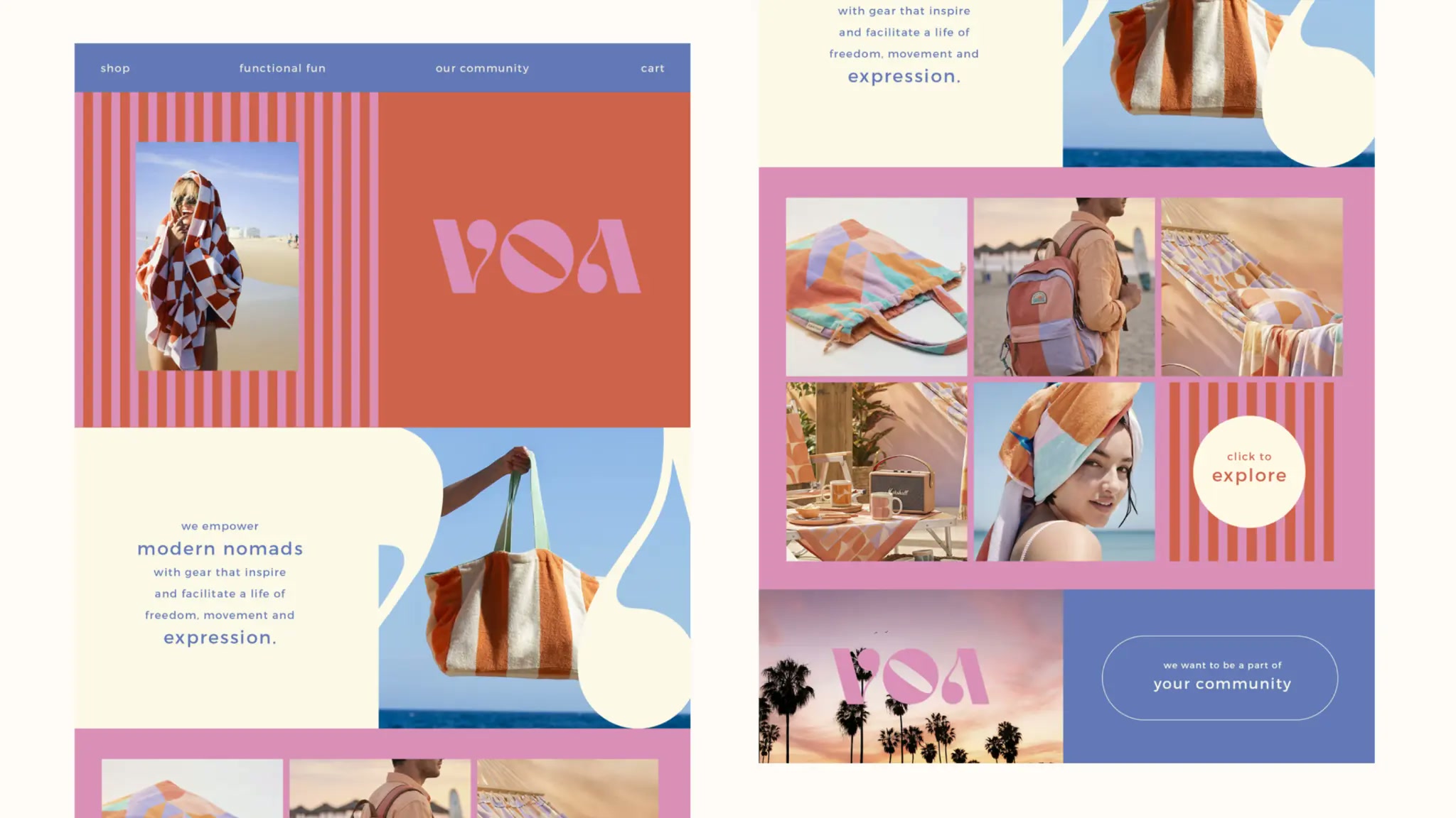
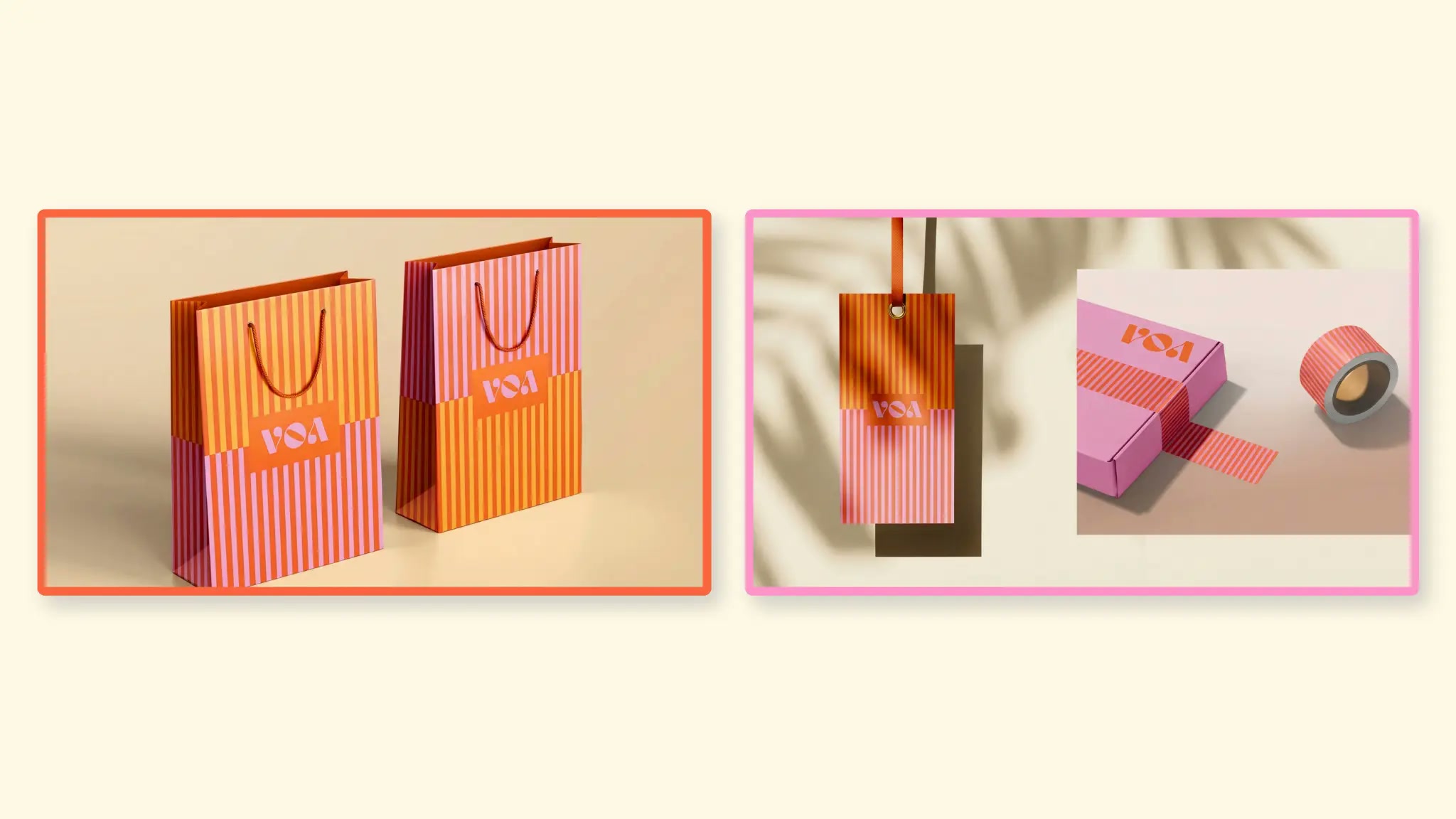
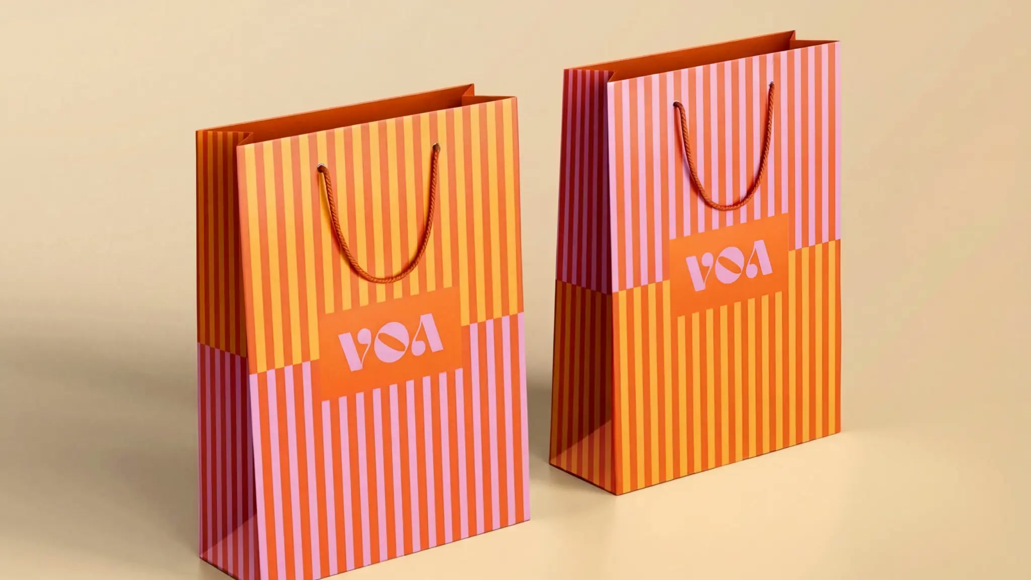
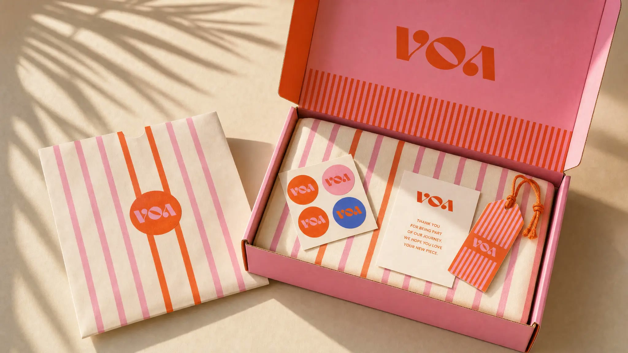

VOA · Functional fun
Ready for whatever's next.
A brand that doesn't ask where you're going. It just assumes you're already moving, and packs accordingly.
07 · Scope
What we delivered.
Positioning and territory, naming rationale, logo system and lockups, palette and type, pattern library, packaging and retail touchpoints, digital storefront direction, and a social content system — handed over as a working toolkit the client's team can extend without us in the room.
- Brand strategy
- Territory, principles, positioning, tone.
- Visual identity
- Mark, lockups, palette, type, pattern.
- Packaging
- Retail bags, inserts, labels, unboxing.
- Brand expression
- Web direction, social system, content grid.