← Work
starbucks-2
Starbucks — Tazo
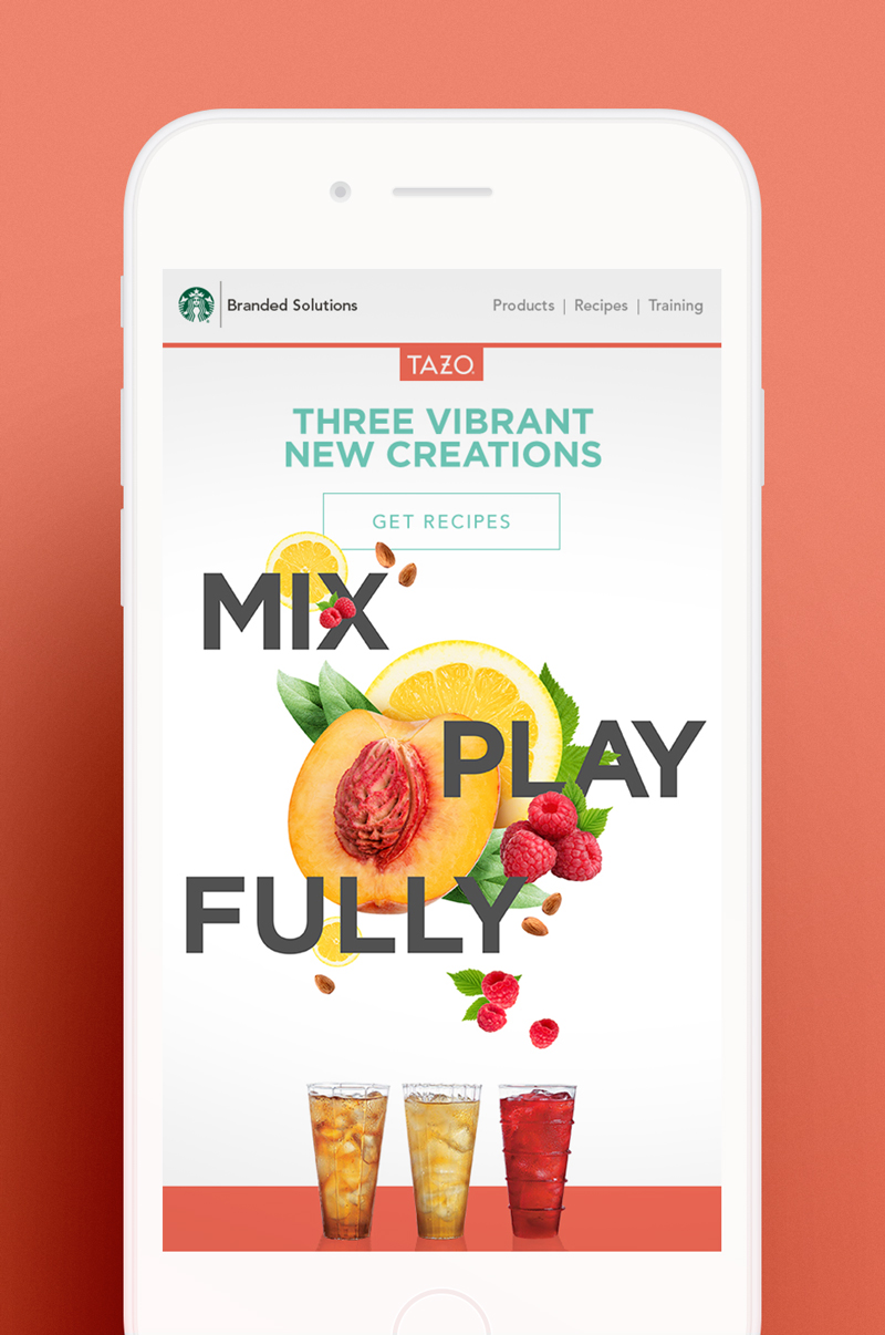
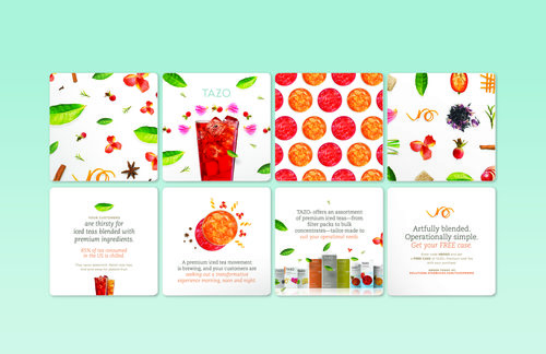
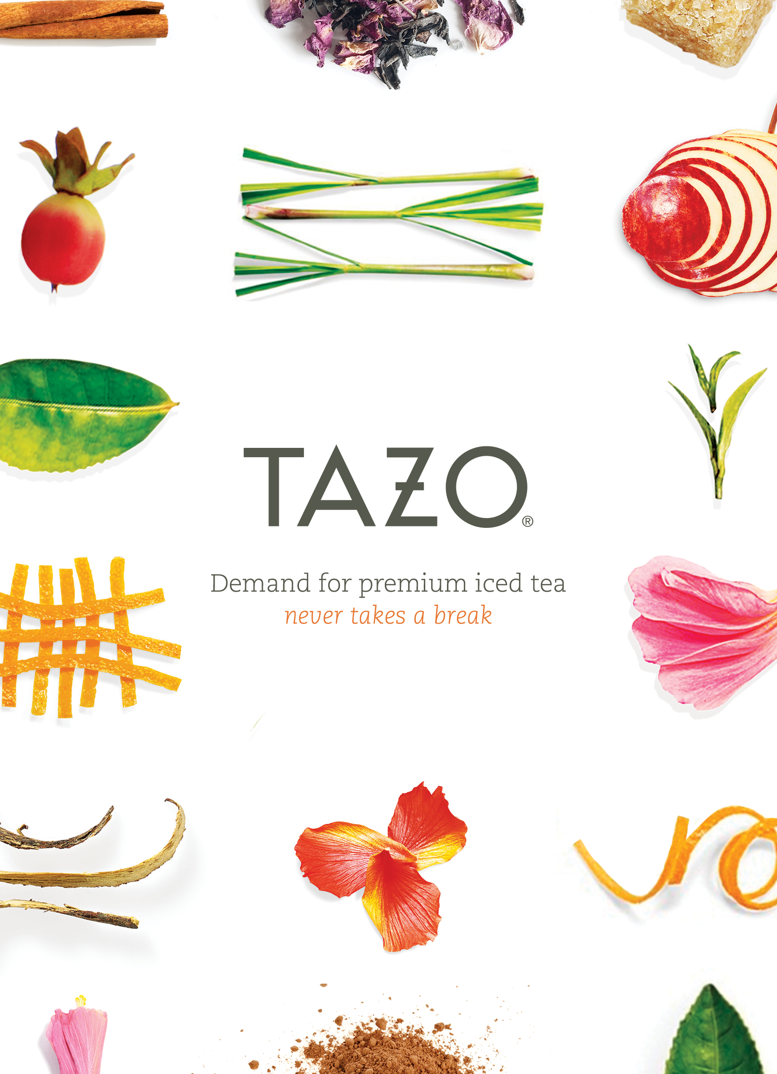
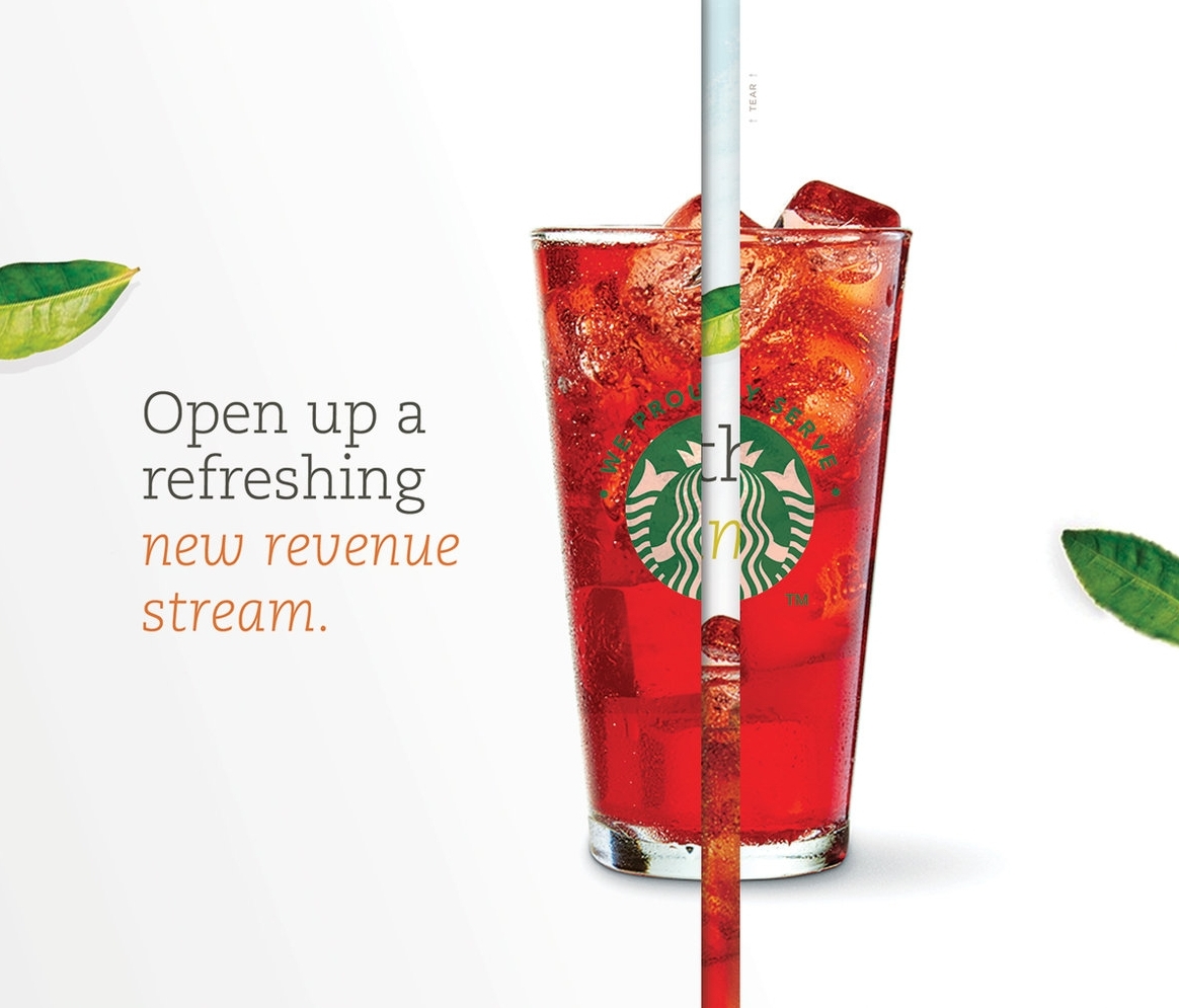
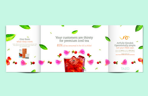
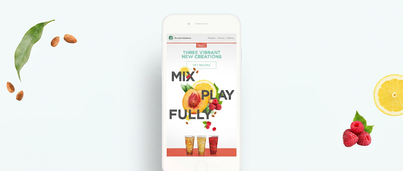
Visual system work for Tazo within the Starbucks SBS account at E/LA Advertising. The brief was to articulate the breadth of the tea portfolio without diluting the line's restraint, balancing variety and discipline within the broader Tazo identity.
The system pairs saturated, flavor-specific color with cleared white space and a vocabulary of botanical marks. The output reads as a single line of products rather than a collection of individual SKUs.
Client
Starbucks
Medium
Brand System · Starbucks Tazo
Practice
Design Digital Print
Stills
06