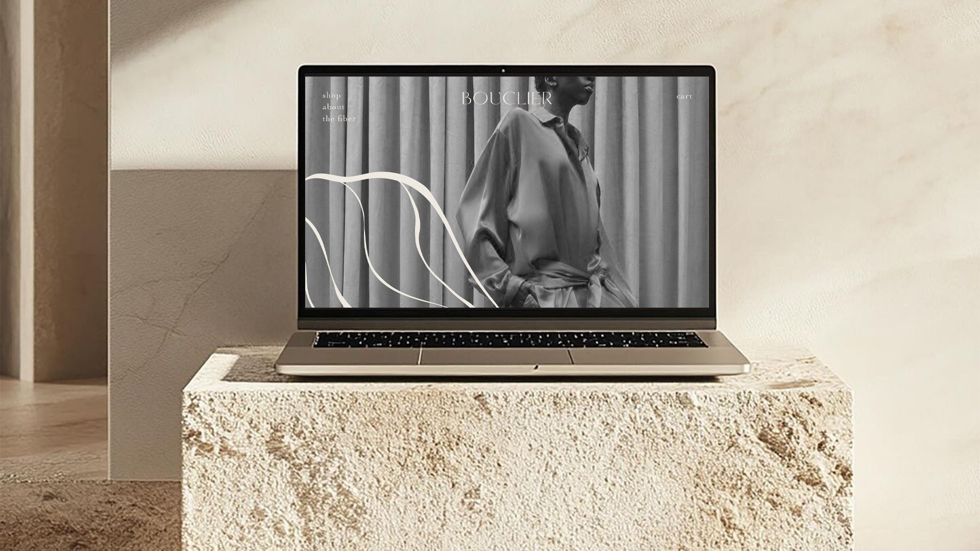
Bouclier · Brand Identity · Digital Direction · Packaging System
The luxury that protects.
Bouclier is a luxury wellness label built on an intimate premise: the most meaningful forms of luxury are felt before they are seen. We turned textile science into a quieter visual world — one where care, comfort and elegance sit on the same plane.
01 · The premise
How do you design something you only feel?
Bouclier makes garments engineered to protect the skin. The technology is real and invisible — which is exactly the problem a brand has to solve. Performance wellness usually announces itself with clinical blues and lab language. Luxury usually announces itself with restraint. Bouclier needed both, without either one cancelling the other out.
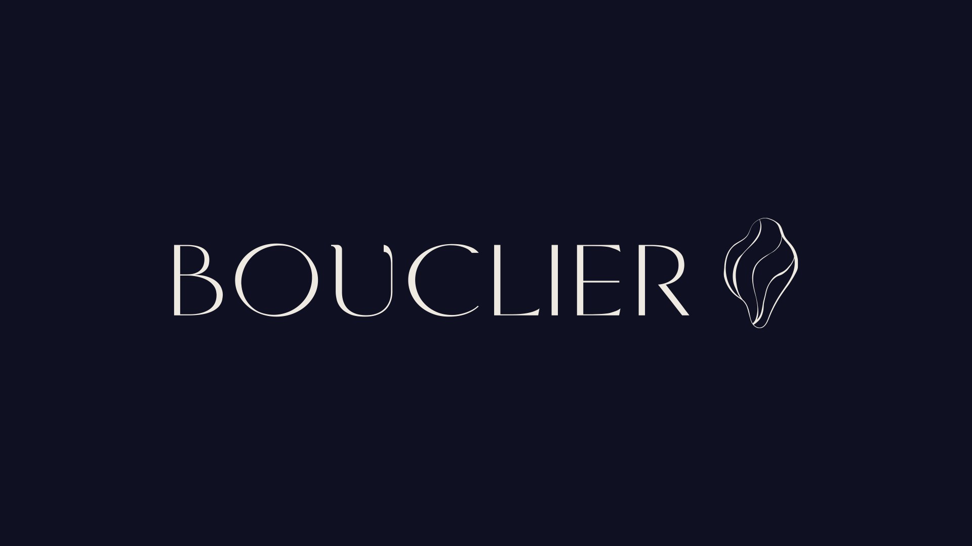
Named after the French word for shield, the brand reframes protection as a living gesture rather than a specification. The central emblem draws from the oyster — an organic structure that shelters, regenerates, and reveals the quiet radiance of a pearl. Science becomes a natural act, not a claim on a hangtag.
That gave us the governing rule for every decision that followed: nothing shouts, everything reassures. Where a competitor would add a badge, we removed one. Where a competitor would explain, we let the material do it.
The result is a system where luxury is registered as calm — soft science for everyday life.
02 · The modern shield
A language of quiet protection.
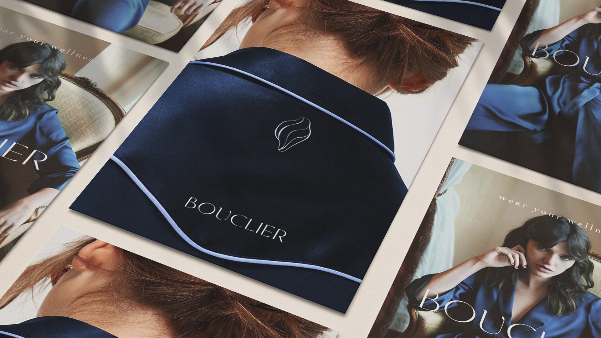
A refined wordmark balanced against a fluid, shell-inspired symbol. Deep navy builds depth and trust; mother-of-pearl and warm ivory bring lightness and tactility. A fine organic line moves across compositions like a soft boundary — framing imagery, setting rhythm, and tying every expression back to the central idea.

Archetype
The Caregiver meets the Sage — care that is intelligent, luxury that is quiet.
Voice
Calm, poetic, sensorial, trustworthy. Never clinical, never cosmetic.
Emotional palette
Serenity, purity, discreet elegance — registered before it is read.
- Science
- Purity
- Comfort
- Balance
- Essential luxury
- Regeneration
03 · Typography
Grace in the details.
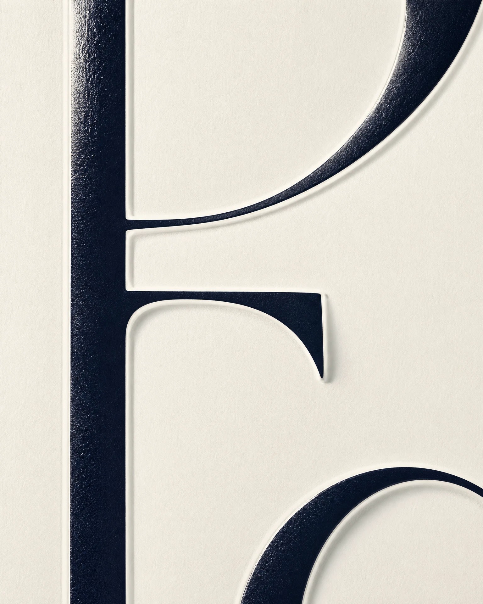
The pairing is intentionally soft but distinct: a poetic display voice carrying emotion, and a classic editorial voice carrying clarity. Neither font works alone — the tension between them is the brand's tone of voice made visible.
- 01 · Display
- Canela Light
- “Wear Your Wellness”
- 02 · Editorial
- Editorial New
- Soft science for everyday life.
04 · Color
A study in depth and light.
Three colors, treated as material rather than decoration: a calm balance of protection, clarity and soft luminosity.
Mother-of-Pearl
Pantone 663 C
Purity, calm, regeneration. The breathing surface everything else sits on.
Light Gray
Pantone 5405 C
Technology, balance, lightness. The science, spoken quietly.
Deep Blue
Pantone 2965 C
Trust, nobility, depth. The shield itself — used sparingly, never decoratively.
05 · Digital presence
Designed to feel restorative.
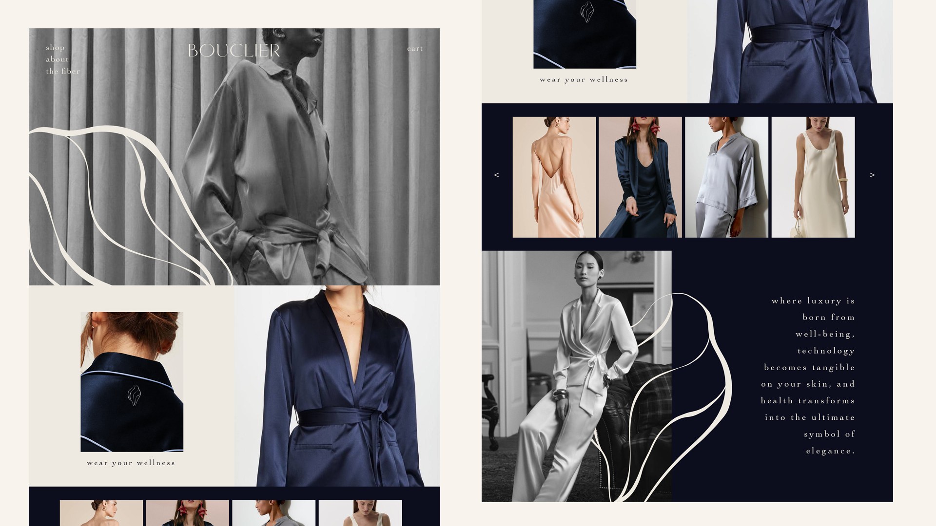
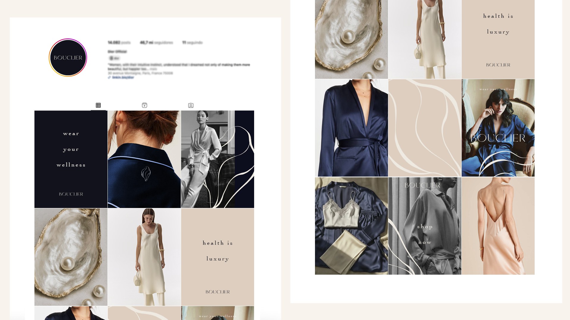
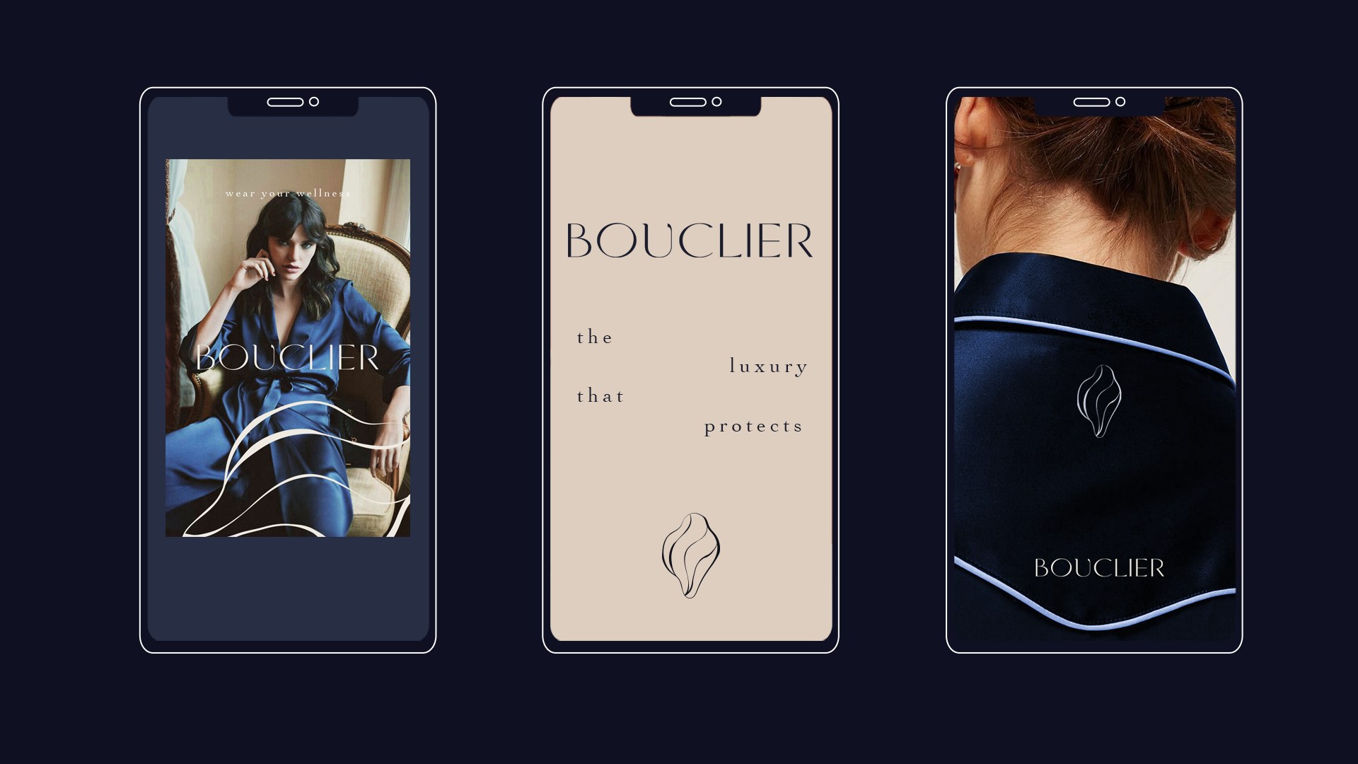
Generous spacing, understated type and tactile references let the product and the philosophy move together. Scroll is slow by design. The digital world is as composed as the garments themselves.
06 · Designed to be held
A tactile ritual of care.
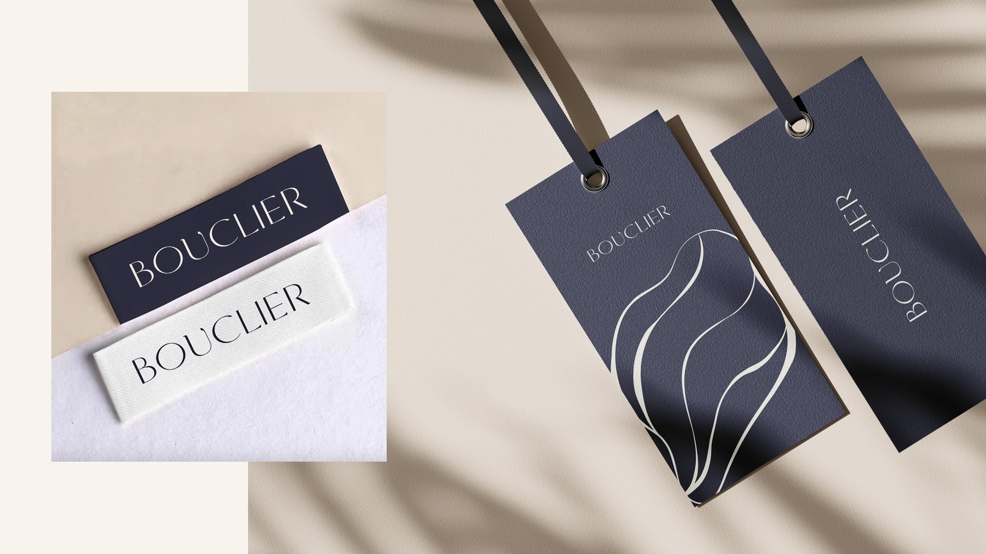
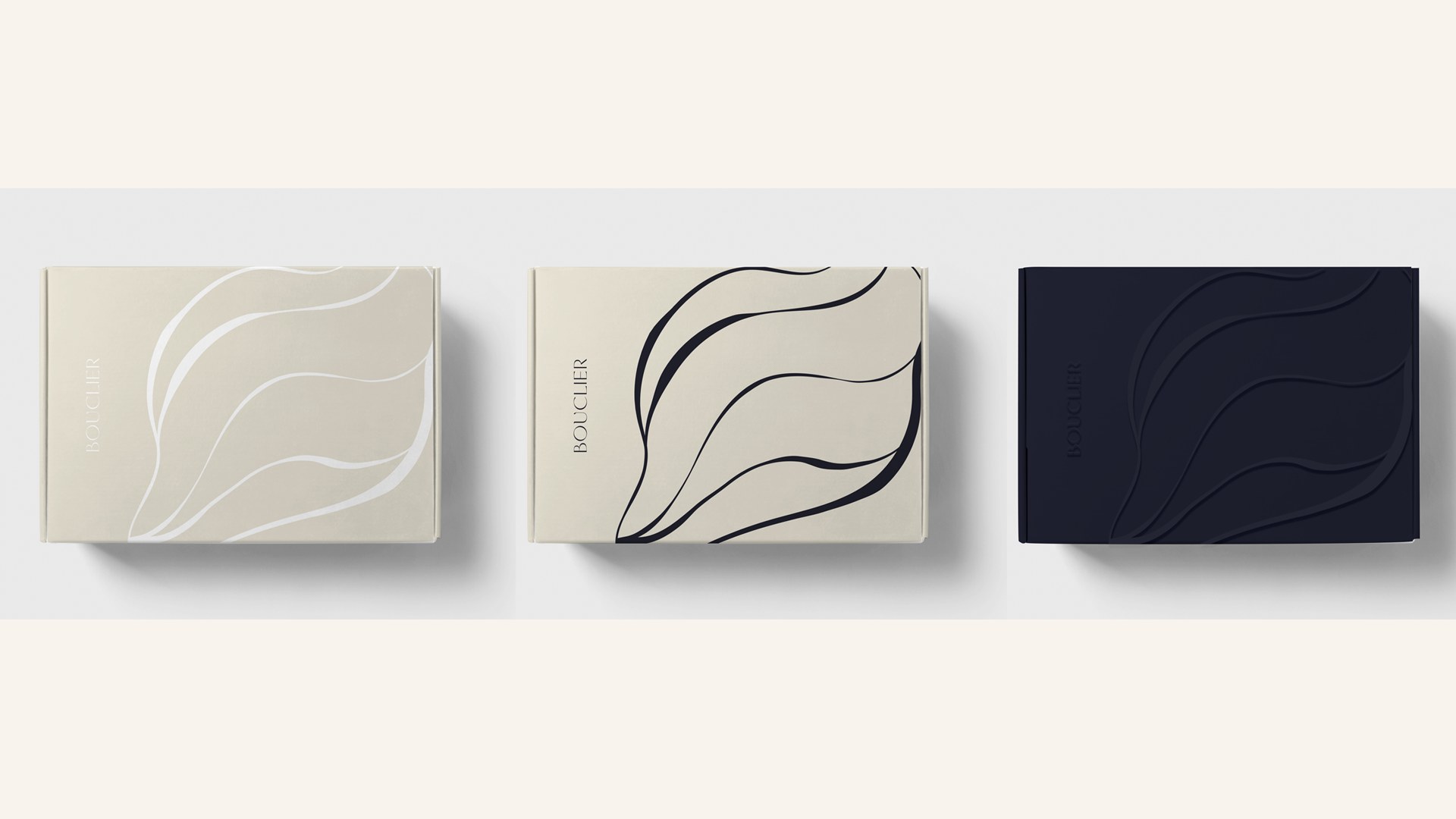
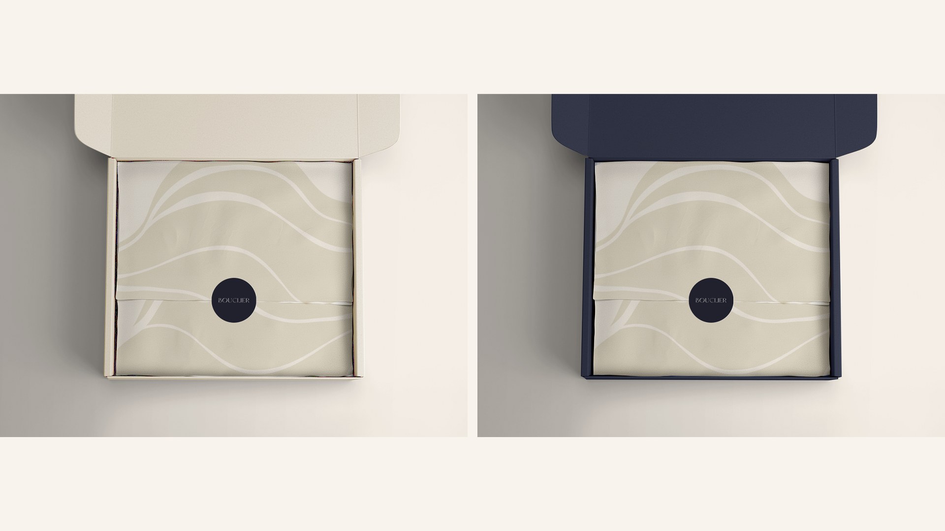
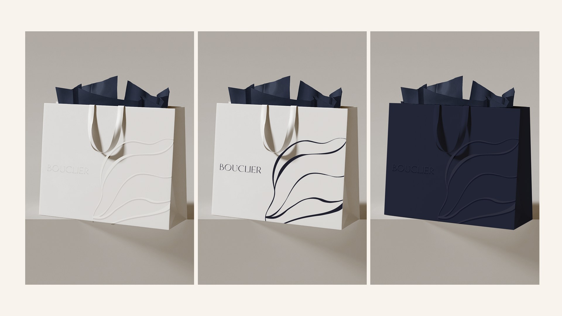
Woven labels, swing tags, gift boxes and tissue layers translate the codes into a physical sequence — elevated but never excessive, protective but never rigid. The unboxing is the first time the wearer feels the brand before they see it.
Bouclier · Wear Your Wellness
Soft science for everyday life.
Le luxe qui protège. A brand that does its work quietly, and is recognised by the calm it leaves behind.
07 · Scope
What we delivered.
Positioning and archetype, naming rationale, emblem and wordmark, typographic pairing, Pantone-specified palette, editorial art direction, digital and social direction, and a full packaging system — handed over as a working toolkit the client's team can extend on its own.
- Brand identity
- Emblem, wordmark, type, palette, protective line.
- Brand strategy
- Premise, archetype, voice, emotional palette.
- Digital direction
- Site direction, mobile system, social grid.
- Packaging system
- Woven labels, swing tags, boxes, tissue.